How to Select Great Photos for Your Website
Choosing photography for your website can feel like a daunting task, but it isn’t something that should be cast aside to do at the very end of a project. Taking the time to select good photography will enhance your site’s experience and build confidence in your brand.
On the other hand, rushing the process and selecting mediocre imagery can hurt your brand's credibility and result in a distracting and frustrating user experience. While we almost always suggest that our clients work with a photographer for the best results, we also realize that not every budget can support a full set of custom photos.
Whether you are using custom or stock images, follow the tips below to make sure you are using the best images possible for your new website.

Strive for Authenticity
With people spending more and more time online these days, their expectation of an authentic experience has also risen. Users want to see photos of you and your business that match what they know about you, not the same stock photo that they’ve seen on five other websites. Depending on your business, you may be able to achieve this using stock photography, but you will need to be very careful with the images you select.
One of the most important things you can do, whether you are using custom photography or stock, is to make sure the images you are using feel natural. If the photo feels unnatural to you, it’s going to feel unnatural to your users as well and they may start questioning other things on your site. If you are using stock images, spend time looking beyond the first page of results for photos that fewer people are using. These are more likely to be unique to your users.
It is important to remember that your website should evolve and change with your business. If you don’t have the budget for custom photography, stock photos can be great for the initial launch of your website. But over time, you can work with a photographer to replace these with custom images that better represent your organization, ultimately creating the authentic experience that your users seek.
Here are a few examples of photos where the subjects feel natural and relaxed. The photos feel as if they were candid shots rather than a posed photo shoot.


Choose Cohesive Photos
As you are selecting images for your website, put them all next to each other. Do they feel like a cohesive set of images that fit as a part of your brand? If your images feel like a mismatched set of snapshots, it might be worth spending the time to figure out what the common thread between them should be. Some things to consider when selecting cohesive images include:
- Emotion: Are you trying to evoke the feeling of a high-end luxury resort, or an approachable and friendly local business.
- Color and Tone: Does it make sense to use light and airy images with low-contrast, or stylized images with high contrast that focus on a few brand colors.
- People: The people in your photos are representing your brand, make sure that when you select your photos you would be happy to have any person in a photo representing your company.
Unless you are taking all new images for your website or you already have a great photo library to work with, compiling images that all feel like a cohesive set can be challenging. Using photoshop to edit your images, whether they are your own or stock, can be a great way to create a cohesive feel while also making them more branded. This could include anything from adjusting the colors and contrast to applying a full color overlay. However you edit them, make sure to be consistent from image to image. Having a set of photos that addresses all of these points will not only help your website feel more pulled together, but will help to make your brand more recognizable outside of your website as well.
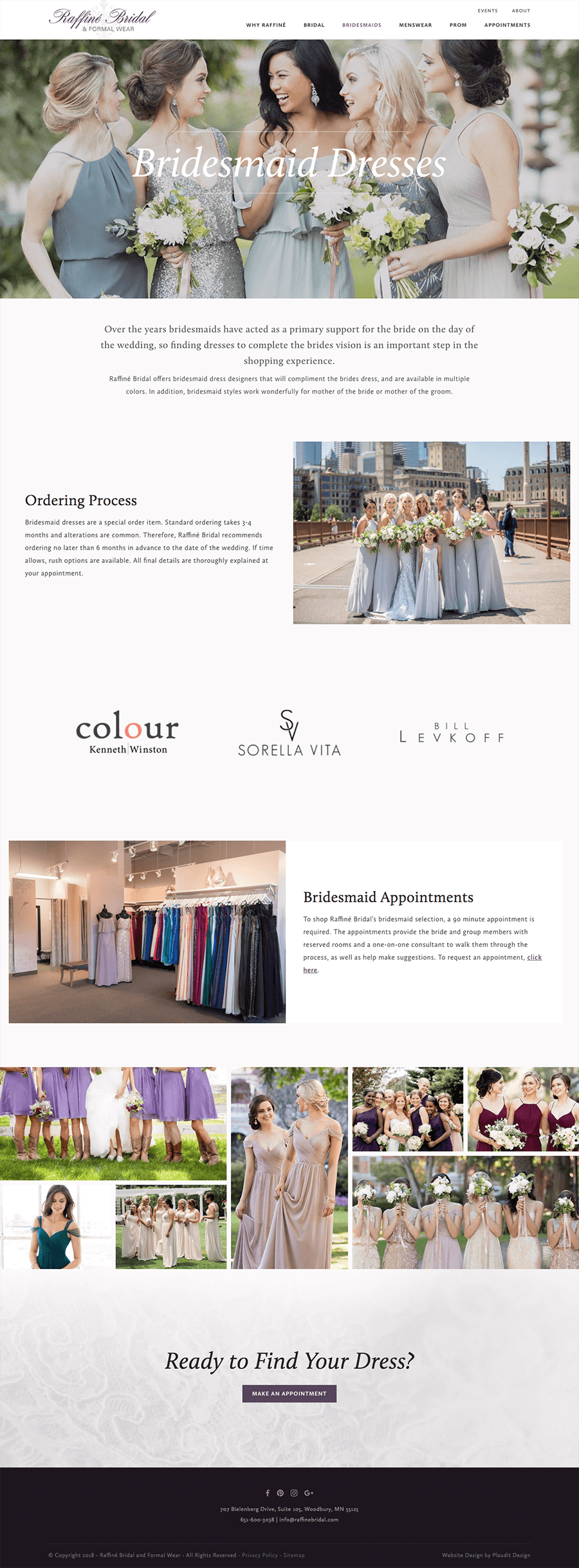
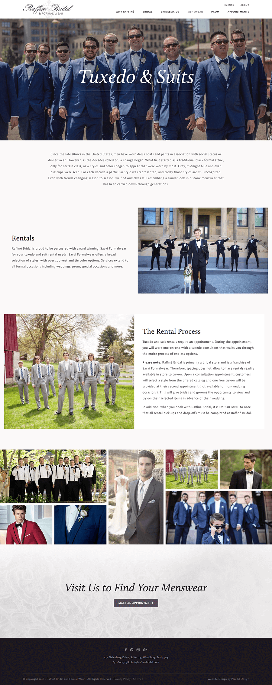
Here are two examples of websites we have created that do a great job of using cohesive imagery throughout. Raffine Bridal has a light, airy feel to match the dresses that they sell, while Nichols Kaster uses dark, strong images to reflect their dedicated team of lawyers.


Consider the Context
While you want to have photos that all feel like a cohesive set, you also want to make sure that you are considering how each photo will be used within the website. For example, a portrait-oriented photo that works well nestled in your content may not work as well for a full-width masthead image. Even though it may be a fantastic photo, it is likely to be unusable due to its vertical orientation and how it will be cropped. Another important consideration is how the image will be interacting with the content on the page. You don’t want to choose an image full of people, only to have all of their faces covered by a headline.
When you are selecting images, look for a mixture of full spaces and scenes, as well as close-up shots. Having this mixture will give your website variety while also giving you flexibility on where you can use images. Shots that capture a larger area can be zoomed in and used in multiple contexts without cropping out any important areas. Close-ups are not as versatile, but are great for drawing attention – such as highlighting a specific piece of information or a product feature.
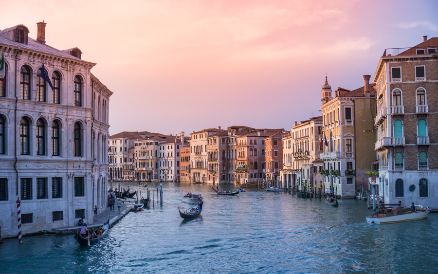
The photos below would work great for masthead images. The strong horizontal layouts could be cropped without losing any context, and text could easily be layered over the top without obscuring the main focus of the image.



The Human Element
Photos of people are a great way to grab a user’s attention quickly and allow them to connect with your business or product. Even if the main focus of the photo is not a persons face, having some sort of human element can bring a lot of warmth to your site. This is an area where using stock photos can be very difficult. The people in these images are representing your brand and if a user gets the sense that the photo is from a stock site, it could hurt your brand’s credibility.
As you are selecting images, make sure the people in your images align with your target demographic. This can be anything from age to gender to income level, just to name a few. Select images that feature a diverse and inclusive group of people to avoid alienating segments of your target market. This helps to ensure that all potential customers feel welcome and included.
Below are examples of images that do a great job of showing a range of diversity.




Use "Professional" Photos
This one may seem obvious but it is probably the most important one to remember. You can meet all of the items above, but if your photos are low-quality, your site is going to feel that way as well. While cell phone cameras are getting better and better every year, we strongly recommend using a professional camera (and photographer) if you plan to capture your own photos for your site. A skilled photographer considers the lighting, the composition, and even the characteristics of different lenses to capture the perfect photo.
A good camera also ensures that the photos are of a sufficiently high-resolution so they can be used in any situation. You can always crop an image or scale it down to make it smaller, but there’s no way to make a small image bigger.
Conclusion
Photo selection is an often overlooked part of the website design process but the right photos can do so much more than make your website look good, they can be a key part of your website’s success. Make sure to give image selection the time and attention it deserves. (need more here…)
Bonus: Where to Find Good Stock Photos
If you are going down the path of using stock photos, make sure you are choosing from well-known, reputable stock photo sites. It is important to pay attention to photo licenses to make sure you are legally allowed to use those photos on your site. Here are a few sites we recommend to our clients:
- iStock & Shutterstock: With their huge inventory of images in a wide variety of subject matter and styles, you are almost guaranteed to be able to find images that will work with your site. Just remember to dig a bit deeper than the first page of these sites since so many people use these.
- Unsplash, Pexels, and Pixabay: If you don’t have the budget to purchase every image for your site, free stock photo sites can be a great resource. They tend to not have quite as much of an inventory/great options on your site so we would recommend using a mix of these free sites with either your own images or paid for stock photos. There also tend to be more of the very “stock” feeling photos on these sites so it may take a bit more digging to find an image that will work for your needs.
- Tonl: A relatively new stock photo site that focuses on culturally diverse photos that can be hard to find on other stock sites. In additional to being diverse, all of their photos are really high quality and don’t have that “Stock” feel to them.
- Stocksy: Similar to iStock and Shutterstock, Stocksy has a large volume of photos to choose from with the added benefit of being highly curated by photographers. This means there are far fewer “stock” feeling photos to weed out of your search. In addition, you can also search for photos by color if you have specific brand requirements or a specific look that you are going for.